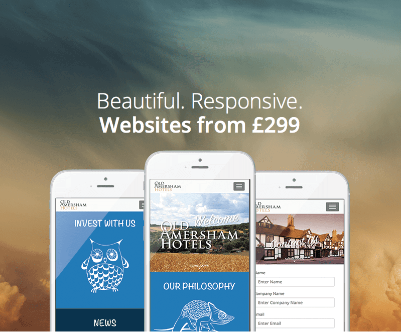
WE’RE MORE MOBILE THAN EVER BEFORE
For the first time, we use our mobile phones more than our desktop computers to search for local businesses. That means more of your potential customers are looking for information about your business via their mobile devices.
WHAT IS A RESPONSIVE WEBSITE ANYWAY?
Websites that automatically reflow and adapt to the screen size they are viewed on. We call these Responsive websites because whatever device they’re displayed on – Mobile, tablet or desktop. It will respond and alter its layout accordingly.
HOW DO I BENEFIT?
- Increase Conversions – On mobile and desktop, a responsive website means your visitors’ experience is enhanced. So, it’s more likely they find what they’re looking for.
- Bigger Audience – Search engines prefer responsive websites. Make sure you appear on Google mobile searches
- Easy to Edit – Built-in content management system. Easily edit text and update images, at no extra cost.
GALLERIES
Showcase your products, photos, premises or your team with striking image galleries. Add ‘lightbox’ functionality so your customers can click and zoom to see larger hi-res versions.
FORMS
Making it easy for visitors to contact you is vital to get leads from your site. Add forms that work without having to ‘pinch and zoom’. Create drop down menus, radio buttons or text fields to capture what you need.
MAPS AND OTHER INTEGRATIONS
Integrate Google maps into your site and show exactly where visitors can find you. With zoom and move functionality your customers can navigate with ease on any device, mobile, tablet or desktop. Add videos, facebook feeds, booking links and much more.
PARALLAX SCROLL
Create engaging parallax effects that help you tell the story of your business. Talk to us about how we can use parallax to create striking visual effects.
Ready. Set. Go responsive from £299
We want your web experience to be as smooth and hassle free as possible. To get your site upgraded or to start a new one just pop in to your local printing.com studio for a FREE consultation. We’ll listen to your requirements and talk you through the options.
Here’s what to expect
- Wireframe – Based upon your design and content needs we’ll work up a sitemap and a wireframe of the layout.
- Live Proof – Using the wireframe, we’ll build a live working proof for you to test on different devices and screen sizes
- Launch – Once approved we’ll push your new responsive website live to your new or existing domain
Here is one example we have created with a gallery, contact form, parallax scrolling and buttons. Try viewing it on both desktop and mobile – MitchellsGroundscare.co.uk
