Many of us know the saying “A camel is a horse designed by committee”, denigrating the aesthetics of a camel. To quote another saying however, “Beauty is in the eye of the beholder”.
We all know the camel is in fact a creature perfectly suited to its habitat and that a thoroughbred horse would quickly become the archetypal pile of parched white bones in those arid conditions. Furthermore, unless you take the old testament literally, the camel was not ‘designed’ at all of course – it evolved over many hundreds of thousands of years to become the “ship of the desert”.
“What have camels and horses to do with graphic design?” I hear you ask. Well, very little is the honest answer. I want to talk about the involvement of committees in the creative process and it just seemed like a good introduction.
With graphic design and more particularly branding and corporate identity, things work a little differently to natural selection and evolution. Although sometimes it might seem not as quickly.
Often a client will tell us they want a distinctive logo that stands out and shows their individuality (I do shudder whenever a client uses the words eye-catching, so please don’t). However, in my experience, the involvement of a committee can have the effect of creating bland results – knocking off those corners and ironing out the features that offer that distinction. Imagine a world where everyone had perfect proportions, perfect teeth, a perfect face, perfect complexion, etc. Nobody would be memorable and no-one would stand out from the crowd. Because committees work by consensus, they don’t tend to take the distinctive option, unless a member has the skills to really force something through. That can happen, but it’s fair to say it’s rare.
Often when working on logo design, we will start with a “scatter gun” approach where several designs are suggested, one of which the client should select. This we would then develop further and a logo would evolve. However, what sometimes happens – particularly when a committee or group of people is concerned – is we are asked to see what it looks like if we take the lettering from logo A, the icon from logo B and the colour from logo C and put them together. Sometimes this can work, but more often it can make the brand confused and messy. However the committee will look at their minutes, check it against what we have done and the box will be ticked.
Sometimes a designer will hedge their bets and, as well as distinctive, creative, energetic designs, they might offer a ‘safe’ option. Hoping that the client will go for one of the funky ones but knowing they will almost certainly go for the conservative option. Being pragmatic (I have to make a living) and diplomatic, sometimes it is hard to fight these issues and the designer will feel pressured to just do it and get the invoice in.
What’s the answer?
In my view, it’s about responsibility. I’ve worked on a number of committees and for countless clients and best results are always obtained when FEWER people are directly involved. Committees work best when individuals are given clear responsibilities and have the trust in other members to see their own responsibilities through.
So the approach I would recommend is to make use of a sub-committee of no more than three who will take responsibility to formulate a brief and sell that in to the committee and get agreement. They can then give the designer a clear, well-defined brief. The sub-committee can decide whether the designer has met the considerations of that brief with their designs and, if not, get them to adjust the work accordingly and re-present.
Don’t offer too many options! I would recommend the sub committee just show their preferred choice to the main committee almost as fait accompli and ONLY show other options if there are genuine solid objections.
Opinions
Everyone has an opinion on a logo but actually what’s important is not whether you like it or not, it’s:
1) Is it distinctive?
2) Is it offensive?
3) Does it clash directly with the image we want to put across?
In our other lives, Jim and I (Josie) perform as the band, Milton Hide. We were very excited in the spring of 2018 to release the first recordings of our own songs. Recording the tracks (with the help of our son, Charlie Tipler, a recording genius) took a long time, but we were finally ready to duplicate the CDs (via www.duplicationcentre.co.uk) so our design skills came to the fore. One of the tracks is called Little Fish, the title of the album, so it seemed appropriate to use one of my paintings of fish as the cover artwork. We liked the idea of packaging the CDs in recycled / recyclable materials so decide to make just 100 with limited edition hand finished packaging. Our logo features a lino cut style image of a nightingale (Milton Hide is an area of Wilmington Forest, well know for nightingales) so I created a new lino cut of a nightingale and fish which we hand printed onto the inside of the plain cardboard CD cases. The painting of the fish was repeat printed onto sheets which we cut out and stuck on as labels and we printed lyric sheets to go inside the package. To protect the unfinished card, we wrapped to whole thing in corn starch pouches (sourced from eco-craft.co.uk)
We would like to say a huge thank you to everyone that helped us get this first recording out and to the wonderful Elizabeth Doak for the brilliant band photo shoot in nearby sunflowers. We’re planning to record our full album very soon. You can buy the EP (not the limited edition, they are all sold out) from the Milton Hide online shop.
There, we said it. And it had to be said.
Autumn is the time you need to start thinking about Christmas and New Year promotions, Christmas cards, and maybe a ‘Thank You’ for your clients.
We are full of good ideas, so if you’re struggling, get in touch. If you know exactly what you want, ask us for a quote.
That’s it, short and sweet.
Remember we are still around, even if we’re no longer in the Old Courthouse. If you want to meet up, we can always come into town.
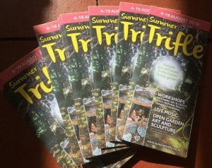
Our dreams of running our own festival started to come true when we were successful in a bid for lottery funding in 2017. Summer Trifle was born. A 2 week mini arts festival in our own grounds in Wilmington, East Sussex, which we repeated in August 2018.
Part of the bid was for publicity, something we know to be a major part of any event, having been involved in the Hailsham Festival of Arts and Culture for many years. To attract sufficient numbers of visitors, you need to get the word out about your event. We designed and printed fliers, posters, leaflets, maps and programmes and created advertisements for various printed and digital publications and social media campaigns. Having learned lessons about our audience (here comes that word…) demographic in 2017, we were able to target our advertising more effectively. By far the most successful piece of the advertising campaign was the printed programme.
Our festival programmes (folded leaflets) are distributed widely to all sorts of different venues: galleries, shops, music venues, pubs, Tourist Information Centres, libraries, campsites, local attractions, hotels, cafes, waiting rooms and fast food outlets. They either go on display on tables or in leaflet dispensers, often alongside many other brochures and leaflets, so the important elements need to be eye catching and visible.
Tips:
One third A4 size is a good standard size which fits into most dispensers and doesn’t slip down behind other leaflets. Ours are A3 double sided, folded to 1/3 A4.
A really distinctive cover image draws the eye and increases the chance of your leaflet being picked up.
Consistency in colour and style in all of your publicity helps to build your brand, making your event easily recognisable and memorable.
We (Jim and Josie) trained in graphic design in the 80’s and were fortunate to be taught the skill of typesetting using lead type. The other traditional skills we learned including hand lettering, font design, colour separation and camera ready artwork have all proved their worth even in the days of computer aided design and print. Returning to our roots, we are delighted to now have a 1950’s Adana letterpress and some beautiful lead type so we are looking forward to doing some ‘artisan’ printing alongside our regular work.
Check your stocks
The start of the year is a traditional time for planning ahead and making decisions about marketing, keeping in touch with your clients and networking. Now is a good time to check the level of your stocks of letterheads, business cards and all the other stationery you will need to put those plans into action. We are not suggesting you have your stock re-printed using letterpress techniques (honestly, we wouldn’t have the strength!) as we have digital backups of artwork for design or print work we have done in the past few years and can quickly make any necessary changes, such as new mobile ‘phone numbers. All you need to do is just drop us a line if you want to place an order.
Did you know that many of the words and terms used in print today originate from letterpress printing?
From the creation of the first metal type printing press in the mid-15th century, letterpress was the primary form of mass produced print of the written word until the 20th century saw the invention of offset printing. Johannes Gutenburg made type from an alloy of lead, tin and antimony, a durable moveable type suited for high quality printing on the letterpress – the inked type was literally pressed onto paper.
Uppercase and lowercase
The ‘lead’ type was stored in cases, with box compartments for each character, number, ligature and punctuation mark. The cases containing the majuscule or CAPITAL letters were stored above the cases containing the minuscule or lowercase letters. Now most typing programmes give you the option to ‘change case’.
Leading
This is gradually dropping out of use on desktop programmes but in all print it is the term for the line spacing between rows of text. When setting lead type you place a strip of lead of a particular point size between each line of text – the leading.
Mind your p’s and q’s
Lead type is reversed so that the imprint bearing the ink views the correct way round. When setting the type it is very easy to confuse p’s with q’s, especially if the last typesetter was less than careful about returning characters to their correct compartments in the case.


 Uppercase and lowercase