by josiet | Oct 22, 2019 | News

Who is Jimbo?
You’ll know him as Jim Tipler, one of the Directors of Hailsham Creative and chief designer. Here you can see his own website, By Jimbo! (yes, it’s a site created by Hailsham Creative, isn’t it gorgeous!?) with many examples of his branding and identity work.
Jim says:
There aren’t many Jimbos around so I adopted it for my business.
I can help you find a distinctive style – something that will stick – something that will have a shelf life.
It might have a story. It WILL have integrity.
If these are attributes that you also aspire to, we should chat. I think we could work together.
One of the great things about my job is finding out about you, your business and your story.
Branding of course doesn’t simply mean creating a logo. It means keeping that visual language consistent across every type of media you use and, through Hailsham Creative I can help with that.
So, if you are interested in talking to Jimbo about your branding, get in touch and you can meet up for a chat over a coffee.

by josiet | Oct 9, 2019 | Article, Marketing
Plenty of research shows people need to see your marketing message several times, in different ways, before they buy.
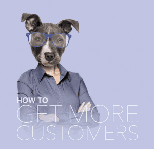
If a customer says no, is it game over? Be honest, do you give up after your first knock back? Many business people do. But that’s a mistake. Dust yourself off. And get back on the horse. To find out more, read our inside guide on How to Get More Customers:
And during October, you can claim £10 instant credit to spend on anything from our range…
by josiet | Sep 9, 2019 | Article, Marketing, Promotions
”But only one of them asked for the order…”
Here’s the secret. If you follow up, you might be the only one who does. Think about it. Would you choose a business who was disinterested at the quote stage? If they’re sluggish then, how responsive will they be when you’ve paid them to work for you?
A quote in the post is good. But it can work harder. Use a folder. A beautiful folder. It gives you gravitas. You’ll look impressive. Use the inside to sell your benefits. Why should they choose you? Fill with photos of other projects, awards or client reviews.
by josiet | Jul 26, 2019 | Article
See the CASE study for all images.
Our clients come in all shapes and sizes. We love working on a high quality sales brochure for a multi-million pound organisation just as much as a flyer for a small, local, single-owner business. But, whatever the size of the client, nearly all projects we undertake have many things in common. Firstly, a client will have a requirement (a logo, a brochure, a website, exhibition display, a video). We will have a discussion with the client and an approach (or maybe several alternatives) are agreed upon. Creative work is undertaken and a design is either agreed upon or progresses with modification. Once a design is approved it will be implemented in whichever medium is required.
That, in a nutshell, is our design process. I purposely have not gone into detail because, although there is much in common, still every project has its own subtle differences in approach.
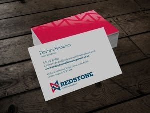
We were asked by Darren to look at a logo for his soon to be launched financial consultancy for which he had decided upon the name Redstone Wealth Management. In our meeting a clear brief was difficult to establish, but he wanted to be recognised as professional, serious and was keen to use the colour red.
There are several approaches you might use for this type of brief. 1) You could write a brief and ask the client to check and sign off on that brief, 2) You could create a mood board from scratch identifying the type of approach you would like to take for this client, 3) You could present just one or two ideas and “sell” one or other in to the client or 4) You could take a scattergun approach and shower the client with ideas. Each of these has its merits and drawbacks but for this project we opted for The Scattergun. Reasons? Mainly time vs results vs budget. 1) Writing and agreeing a brief. There was a timescale in play and a back and forth discussion may have jeopardised that 2) The mood board would take time and therefore budget that this client simply did not have, 3) We aren’t ultra smooth sales people and certainly don’t believe in the emperor’s new clothes approach. So we went for a selection of logos, confident we would pretty much nail it the first time round and keep one or two up our sleeves should we need them.
Brainstorming was interesting and went in several directions, from visuals as diverse as anglo-saxon runes, to rock strata. Each thought was sketched and the strongest would be developed and presented to the client as a standalone logo.
On presentation the client said what he liked and disliked about each. Some were discounted instantly, but we kept coming back to the same four. We developed each a little further to give the client some idea of how it might work in practical situations such as a business card or website banner.
Over the years we have found there are times when you shouldn’t express a preference to a client and times when you should and this was one of those. The client was undecided and needed confident direction. The logo we kept coming back to was based upon an anglo-saxon rune for “stone” and we contrived to form an M and a W within the logo (Management and Wealth). So we pointed out there would be a great story behind it for Darren to pass on in turn to his clients.
Despite not being an expert in ancient runes, he liked this thought very much and we developed it further, showing options for layout and typeface.
I think this demonstrates the difference between a brand and a mere logo. A brand might have a story, it should have some weight behind it, some history or, dare I say, a “journey” behind it.
I’m quite good at the visual language of these things but not so great at the written language, but what I would say is that Darren asked for a logo and has ended up with a brand – something he can flaunt with real confidence, will help him stand out against competitors and serve his business very well for years to come and we are very proud to have been a part of that.
“I can say I enjoyed being part of the journey with you and I do use the story behind the logo when I hand over the business card. I have received positive feedback so far and my clients have really liked it. It brings depth to the brand and is a great starting point during my conversations.”
Darren Ransom
Financial Advisor
Redstone Wealth Management
by josiet | Jul 2, 2019 | News, Promotions
Mmmmm, smooth…
We’re programmed to make automatic decisions. With our senses. It kept our ancestors alive.
Even though we’re no longer chased by giant Koalas, we’ve kept our primal instincts. We react to smell.
To sight. To touch.
The more senses your marketing can activate, the more effective it is. Add an eyecatching image.
Print on super thick 450gsm board, then laminate with a special
soft-touch finish. Make them stroke it. And buy it.
Our Grand Suede range includes Business Cards, Showcards, Invitations, Flyers, Menus and Folders.
Try in July and take an extra £10 off. Delivery is free.
Oh… one more thing…
The Sir David Attenborough effect
Since we watched Sir David Attenborough on the BBC presenting Blue Planet 2, it’s been impossible to ignore the impact of single use plastics on our oceans and wildlife.
We thought it was time to consider what we could do better.
Biodegradable laminated print
On 1st August 2018, we switched all of our matt and gloss laminated print to a new biodegradable laminate. That’s every laminated business card, flyer, folder, booklet cover, appointment card and postcard. It looks like regular lamination and feels lovely. When the print reaches the end of it’s useful life, it composts. Within two years it’s gone. Without leaving any contaminants in the soil.
MORE DETAILS